
Our work · AI & Data
Adding a touch of alchemy to Pendle
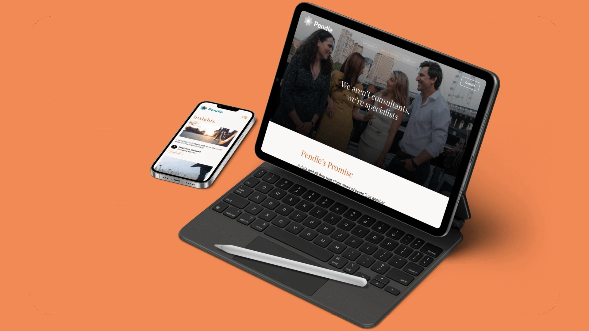
Pendle is a female-led consultancy built on one uncompromising principle: AI done right. We built an identity to carry that ambition.
- Client
- Pendle
- Industry
- AI & Data
- Website
- pndl.co.uk
- Services
-
- Brand strategy
- Visual identity
- Branding
- UX & UI design
- Website design & development
Adding a touch of alchemy to Pendle
It started with one of those calls: unexpected, playful and impossible to ignore. Jessica Bell was on the line. We’d worked with Jess for years at a previous consultancy, and now she was striking out on her own, launching a new venture: Pendle.
The conversation tumbled from brand strategy to modern-day alchemy, turning lead into gold, copper into colour, ideas into meaning. We drifted through talk of blue lakes, witchcraft, imperfections, values and ethics, and somehow, it all made sense.
When you get a call like that, you just know this brand journey isn’t going to be a straight line. It’s a rollercoaster, and you’d be mad not to jump in.

Challenge
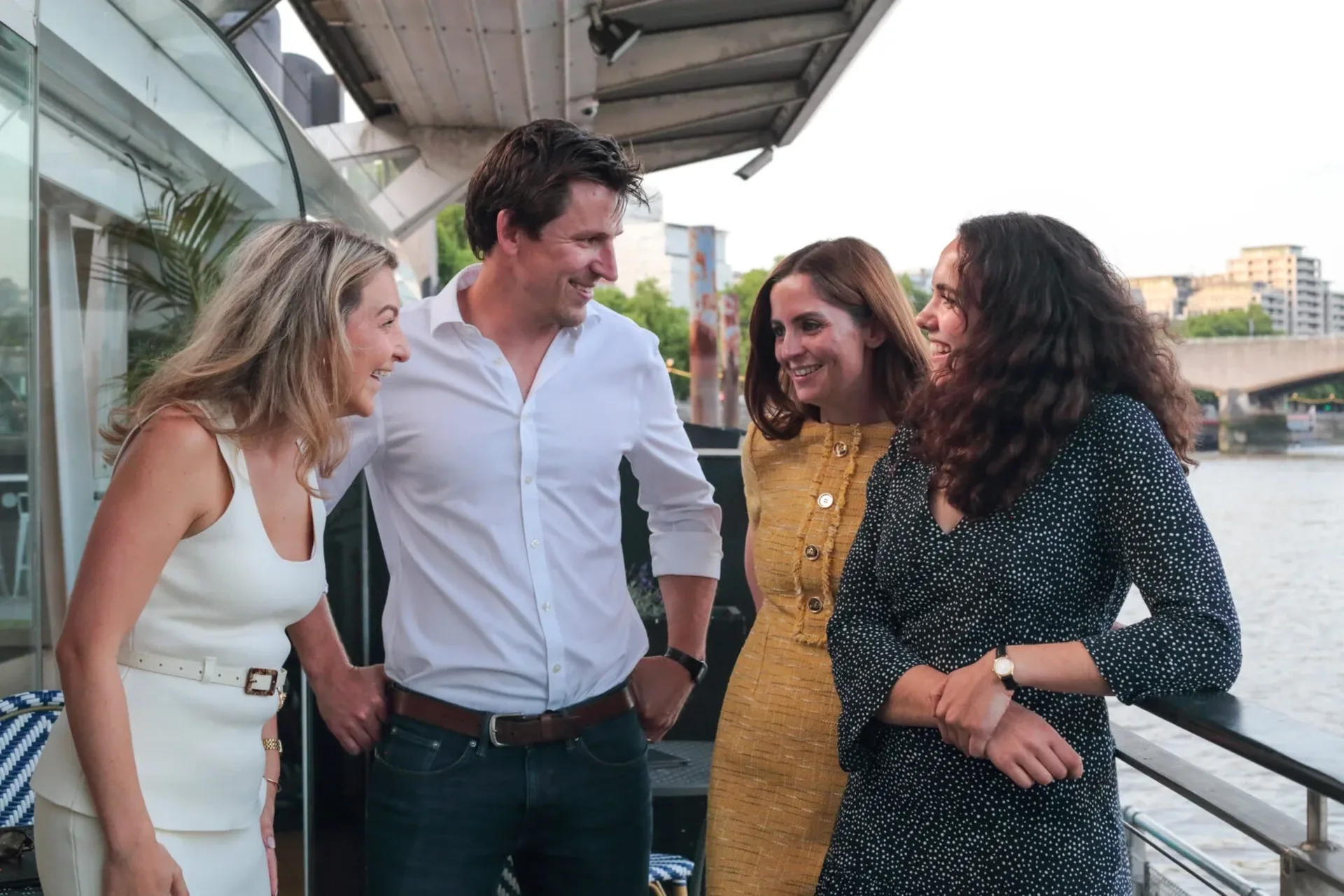
Jess and her team came to us with a vision that felt both radical and necessary: a future where technology drives progress, not just profit. As a female-led consultancy, Pendle’s mission was built on a simple, uncompromising principle: AI done right.
The challenge was to build an identity that could carry the weight of that ambition. In a tech world often obsessed with the “easy, quick and manufactured”, we needed to create a brand that felt genuinely accountable and ethical. It had to stand apart in a crowded, noisy landscape without trying too hard to be different.
The goal was to reflect who they truly are (confident, principled and above all human) while righting the wrongs of the traditional AI narrative.

Immersion
Working with Pendle felt like discovering a quiet chemistry between logic and intuition. We moved away from the sterile, neon-blue clichés of “Big Tech” and leaned into a grassroots aesthetic: raw colours, burnt umber and the tangible world of alchemy.
We looked at how copper transforms over time: how it breathes and oxidises, shifting from warm oranges to deep, atmospheric teals and blues. We mirrored this transformation in the brand, creating a palette that feels alive rather than static.
The design itself embraces “perfect imperfections”. We built in subtle tensions: textures that feel like you could touch them, and deliberate asymmetry. The result is an identity that feels intelligent yet grounded, a true expression of transformation with a human touch.

Brand Identity
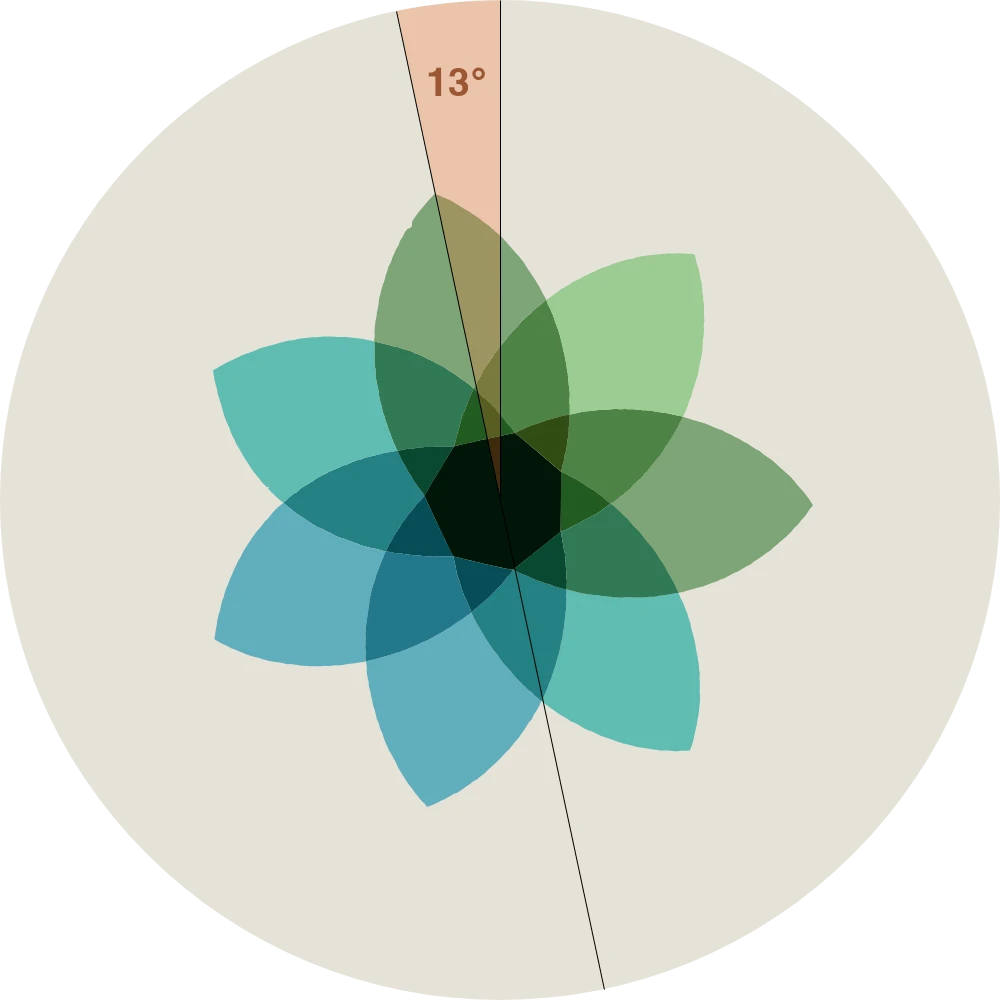
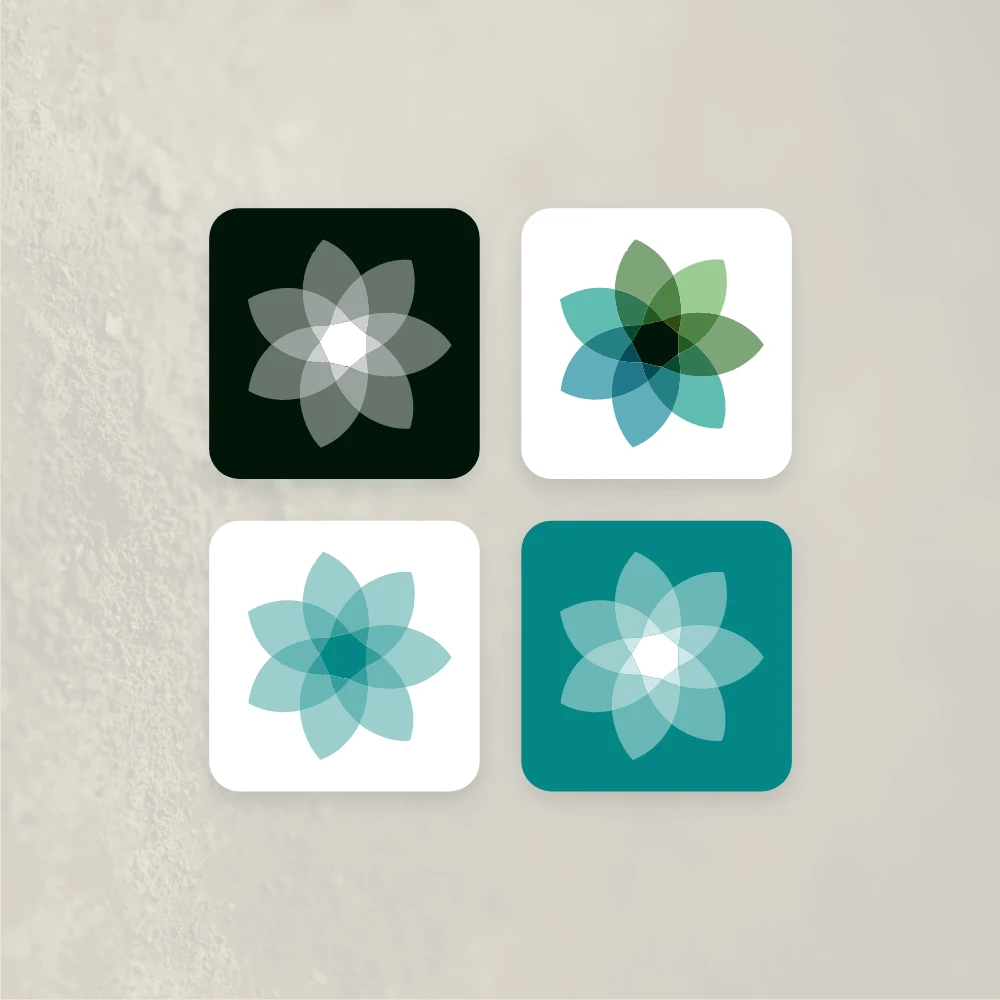
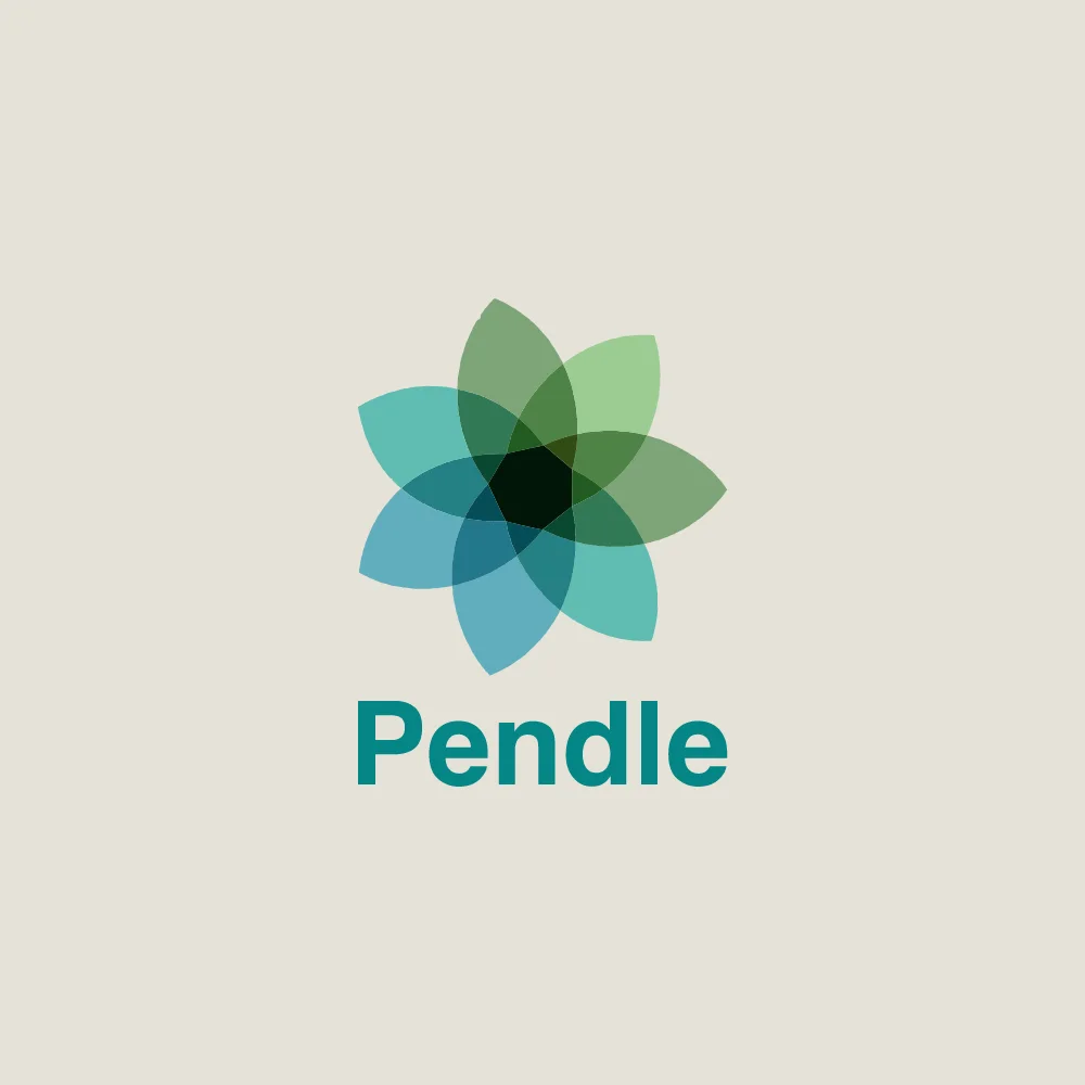
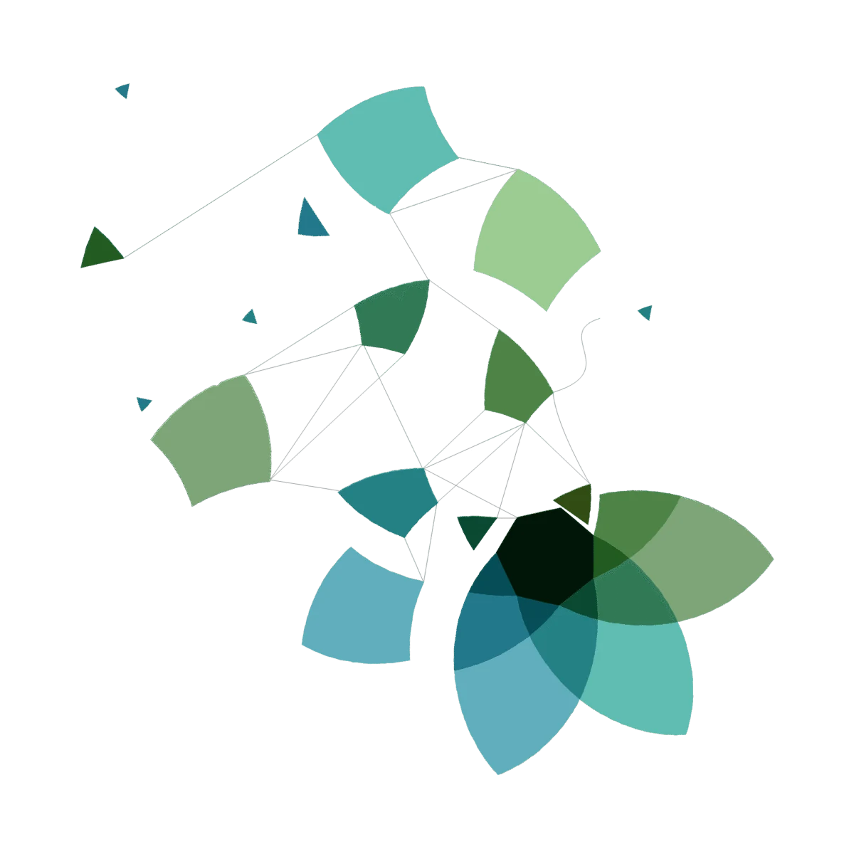
At the heart of the identity is the “Forever Flower”, a symbol rooted in pagan history, with echoes of femininity and witchcraft. It has seven petals and is tilted at a precise 13 degrees, so it never settles into obvious symmetry.
From a distance it looks seamless. Up close, the wavered edges and fragments reveal the human hand behind the machine: imperfection by design, and a quiet defiance that suits a female-led consultancy doing AI differently.
The colours come from copper pigment and oxidation, from warm oranges and burnt umber to deep, atmospheric teals and blues. Copper texture runs through everything the brand touches, so it feels tangible and alive rather than manufactured.