
Our work · AI & Data
Helping Primrose to flourish
Primrose is an innovative Data & AI consultancy dedicated to simplifying AI transformation and building robust data ecosystems for ambitious clients.
A sharp, solid strategy to position the brand as an alternative to the standard consultancy model
A vibrant brand identity that stood out in a fast-growing, saturated space
A new digital home for the brand to flourish and evolve
- Client
- Primrose
- Industry
- AI & Data
- Website
- primrose.io
- Services
-
- Brand strategy
- Visual identity
- Brand guidelines
- Custom icons
- Presentation templates
- Social media assets
- Website design
Helping Primrose to flourish
There’s a certain weight to the word “intelligence” that often feels cold: all steel, glass and binary code. But when we first sat down with the team behind Primrose, the conversation felt different. It wasn’t about the “black box” of AI; it was about the light it could shed on a business.
We talked about growth, about the primrose as the first herald of spring, and how technology, when done right, should feel as natural as breathing. They didn’t want to be just another tech vendor; they wanted to be the ones who untangle the complexity, finding the quiet clarity in the noise. It was a project about transformation, not just implementation, and we knew we had to build something that could truly flourish.
Challenge
The AI landscape is a paradox of promised simplicity and technical noise. Primrose cuts through it, simplifying the journey for businesses overwhelmed by technical debt.
We created a sophisticated, approachable identity that rejects aggressive tropes, positioning Primrose as a strategic partner who balances high-level ambition with a trustworthy, well-governed foundation.
Immersion
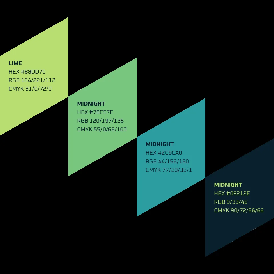
Our “Organic Logic” philosophy reflects natural resilience through balance and clarity. We traded jagged data tropes for an alive palette of growth greens and stable neutrals, paired with clean, confident typography.
By focusing on fluid digital experiences and adaptable foundational structures, we mirrored Primrose’s mission to untangle complexity: a sophisticated, human-first expression of technology meeting genuine business intuition.

Brand Identity
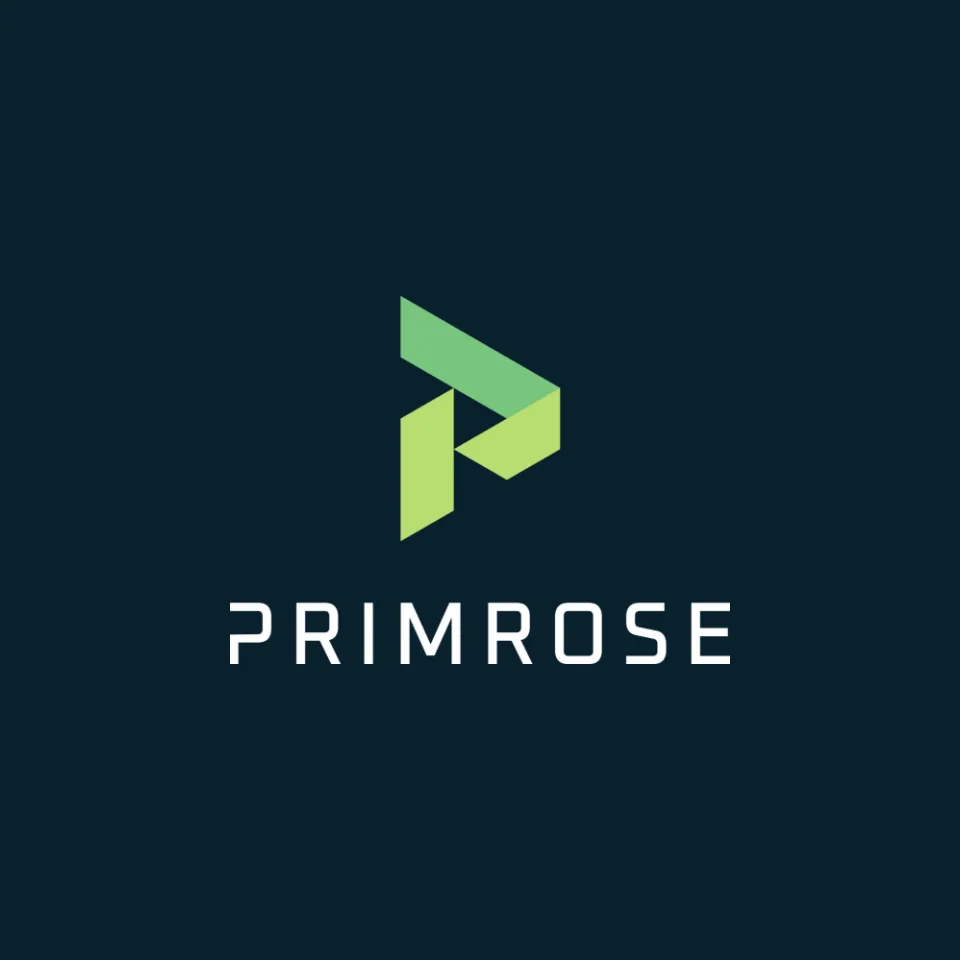
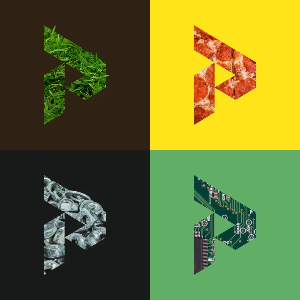
The mark is a P folded from angled planes in lime and midnight, rising like a first shoot. It is built on an isometric grid of triangular modules, so the same shapes can frame photography, hold icons and fill a page.
An inline and a stacked lockup, set in a wide, confident wordmark, cover every place the name has to appear.



Brand Expression
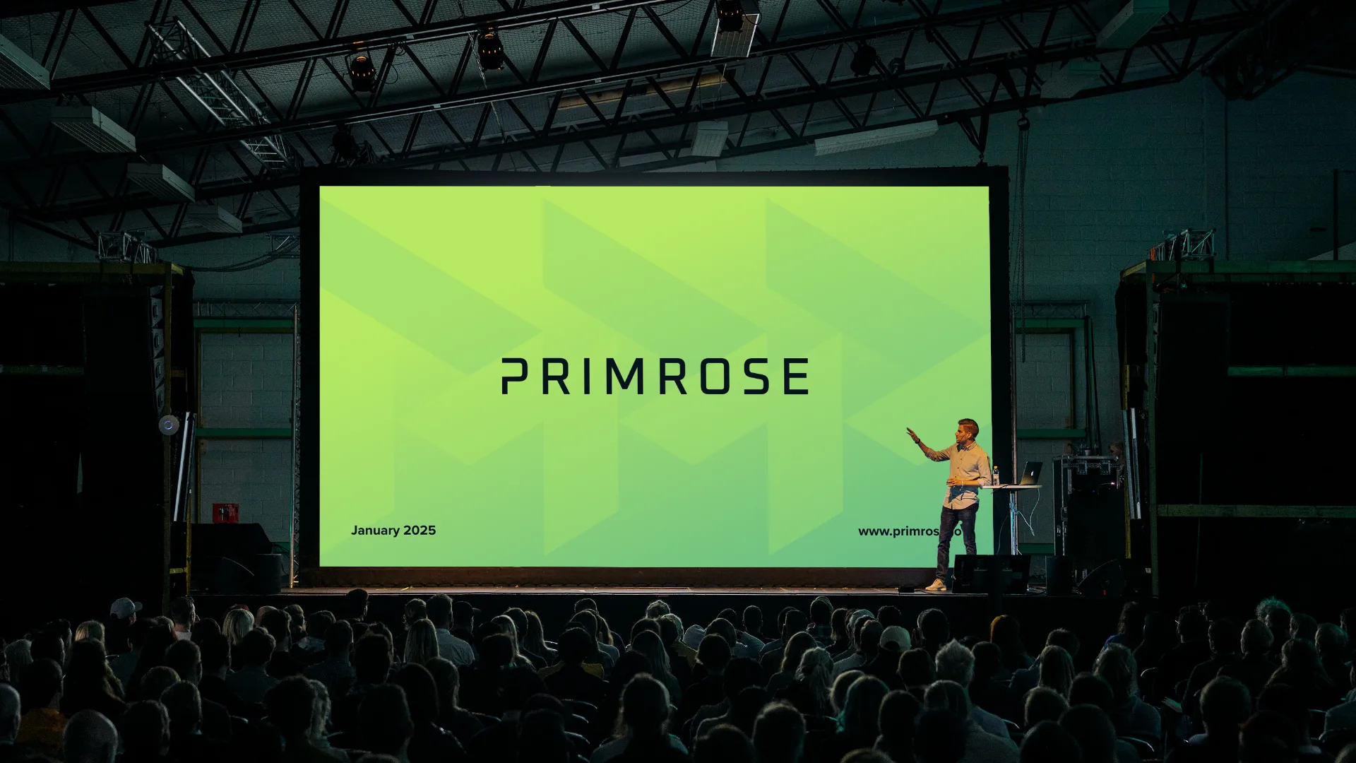
The identity grows into a full kit: a monogram, custom icons, a bold geometric typeface, a lime-and-midnight palette and a set of brand guidelines, so Primrose’s team can make presentations, social posts and merchandise that all look like one company.