
Our work · Sport & Lifestyle
Building a brand that climbs higher
Brushworks is Glasgow’s newest indoor bouldering centre, with a café, a yoga studio and a welcome for climbers of every level.
- Client
- Brushworks
- Industry
- Sport & Lifestyle
- Website
- brushworksclimbing.co.uk
- Services
-
- Brand identity
- Brand guidelines
- Brand expression
- Website design & development
Brand Identity
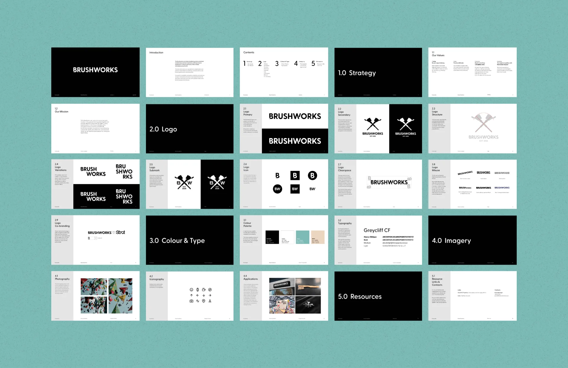
Brushworks is a new bouldering centre in Glasgow with a welcoming, can-do spirit. The identity crosses two brushes into a climber’s crest, with a BW monogram for the small spaces, in confident black and a fresh teal.
It had to be bold enough to read across a busy wall of holds and friendly enough for someone on their first visit. A full set of brand guidelines keeps it that way.
Brand Expression
The brand has to work as hard as the climbers do: on t-shirts and in the café, on the wall and on a phone. A simple kit of crest, colour and type means every poster, post and piece of clothing looks and feels like Brushworks.


Launch
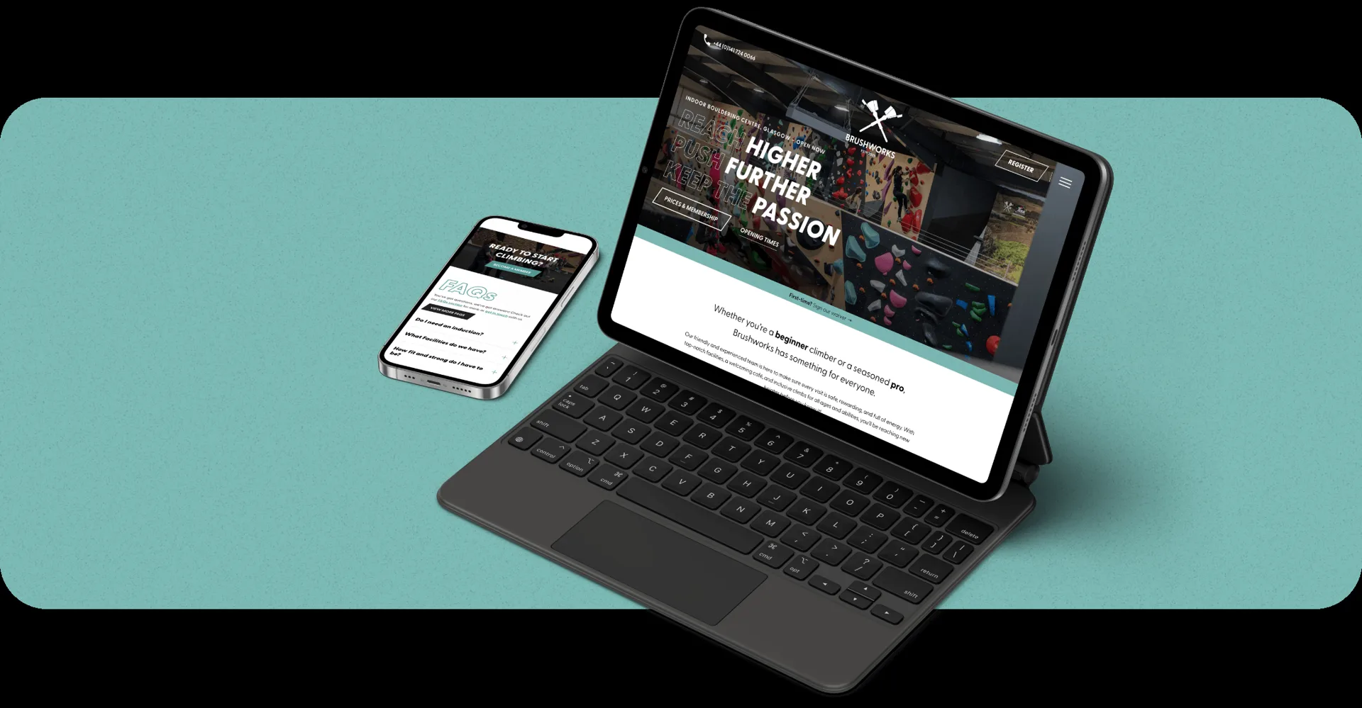
For opening we designed and built the website, so everything a visitor needs before their first climb is easy to find: sessions and coaching, membership, the café, events and opening times. Reach higher, push further, keep the passion.